TO-KITCHEN
interior | 2012 | with studio_01

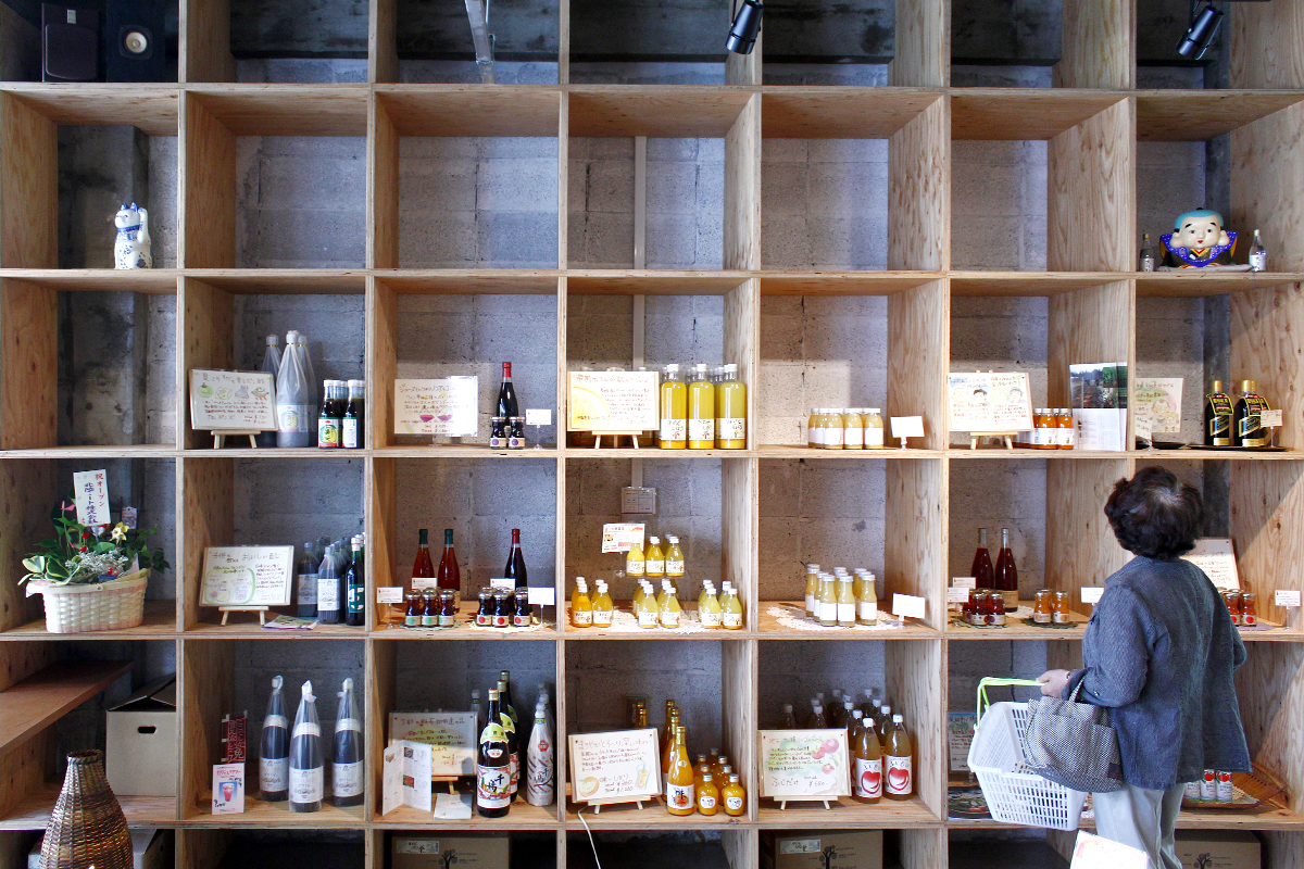
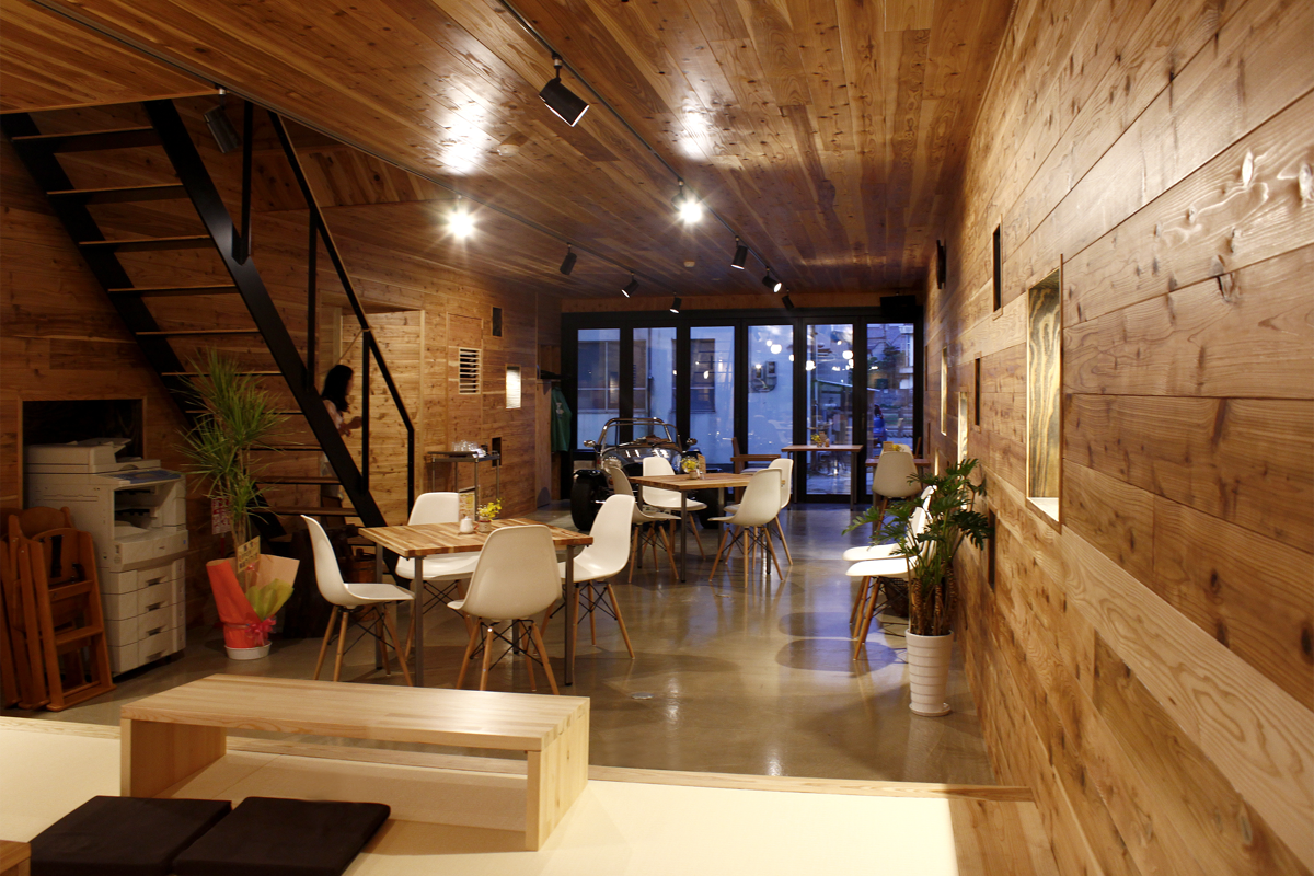
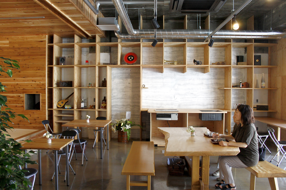
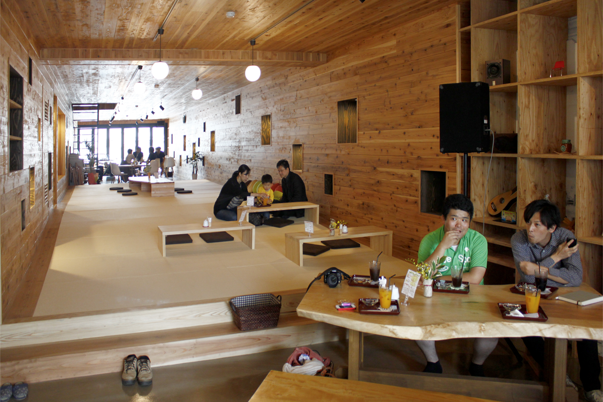
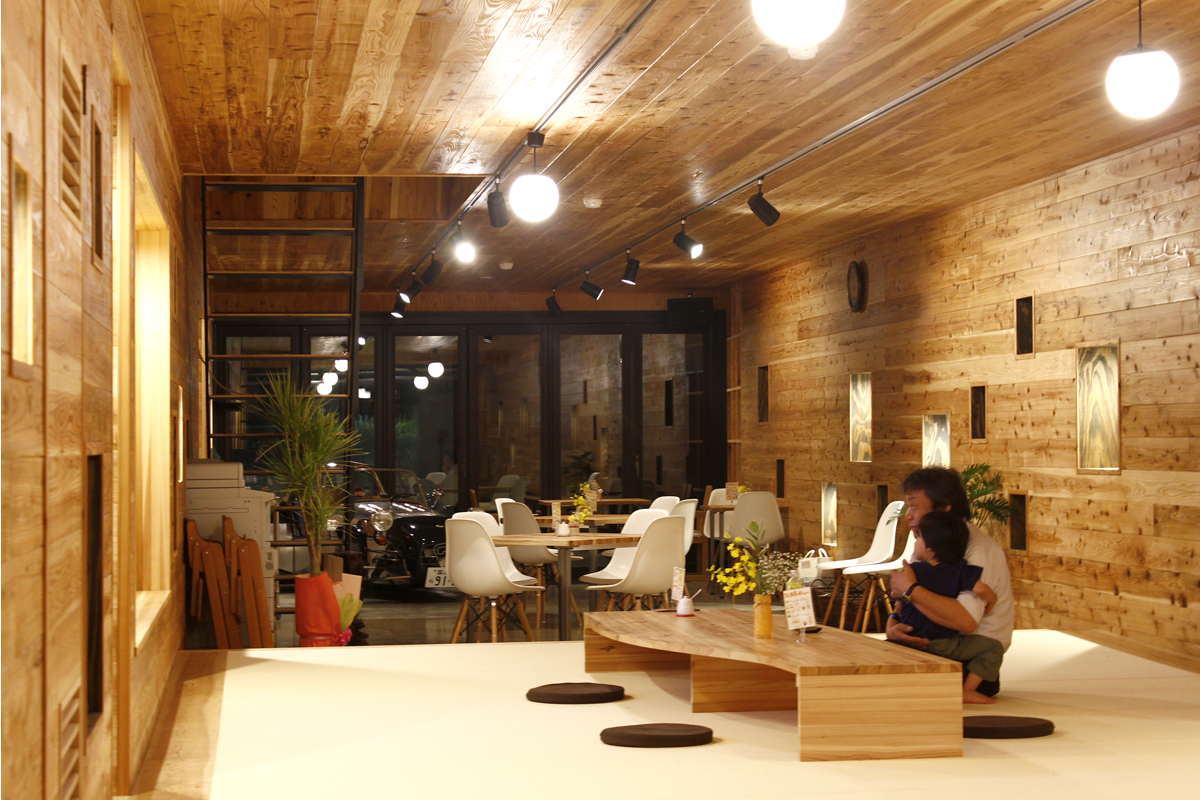
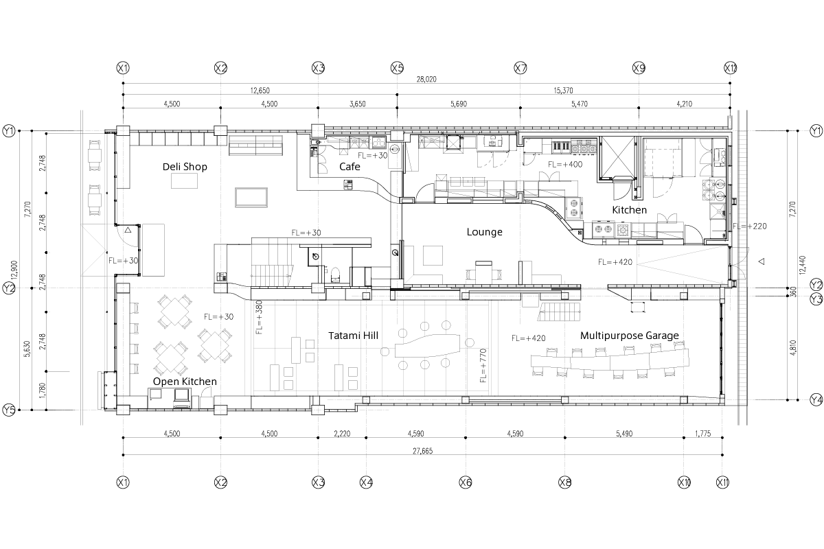
The renovation of To-Kitchen merges three main concepts: waving motion, modernized history, and the connection of three spaces. These ideas integrate to house various programs including a delicatessen, cafe, shop, gallery, event space, and co-working space. With these concepts, the space invites those visiting from the city, prefecture, and beyond to come and enjoy a hub of information through food and drink.
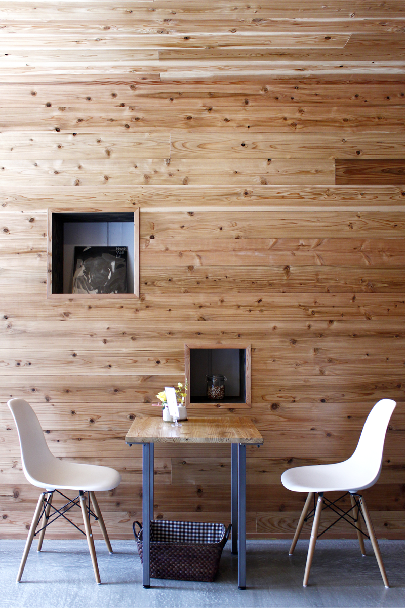
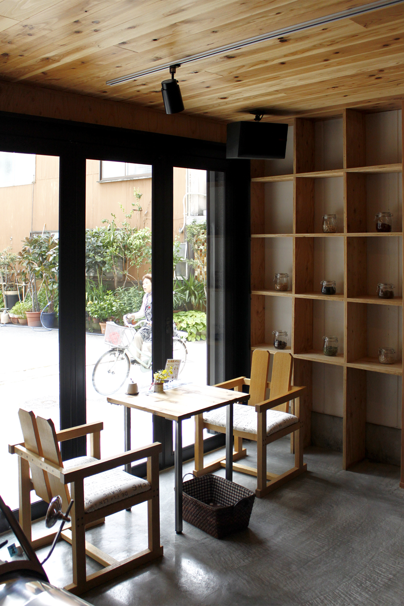
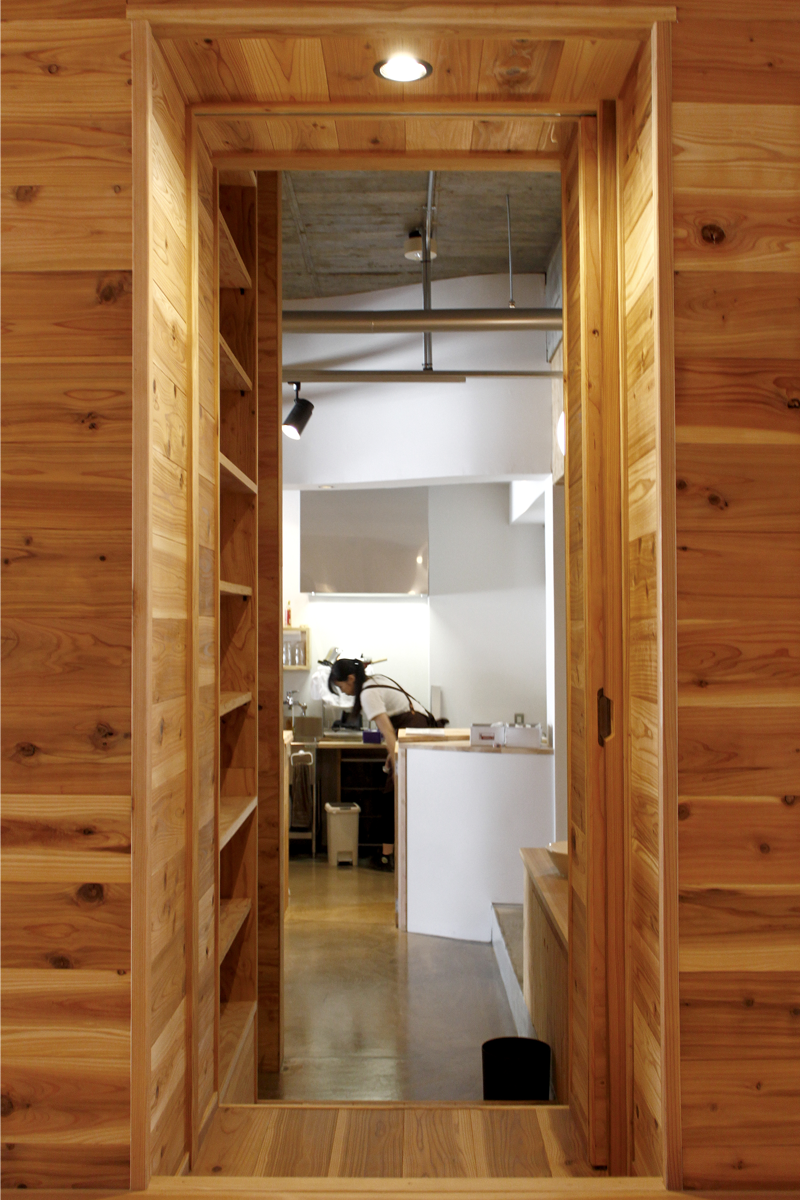
Throughout the interior, there are a number of waves which can be found in plan, elevation, and in detail in the grains of the Japanese Cedar used. One half of the interior’s walls curve to guide circulation though the cafe, while in the other, a tatami floor rises like a small hill for people sit and relax. Throughout the entire space, the grains of wooden boards flow along the walls and ceiling.
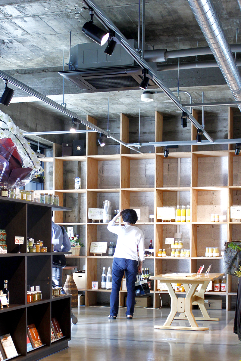
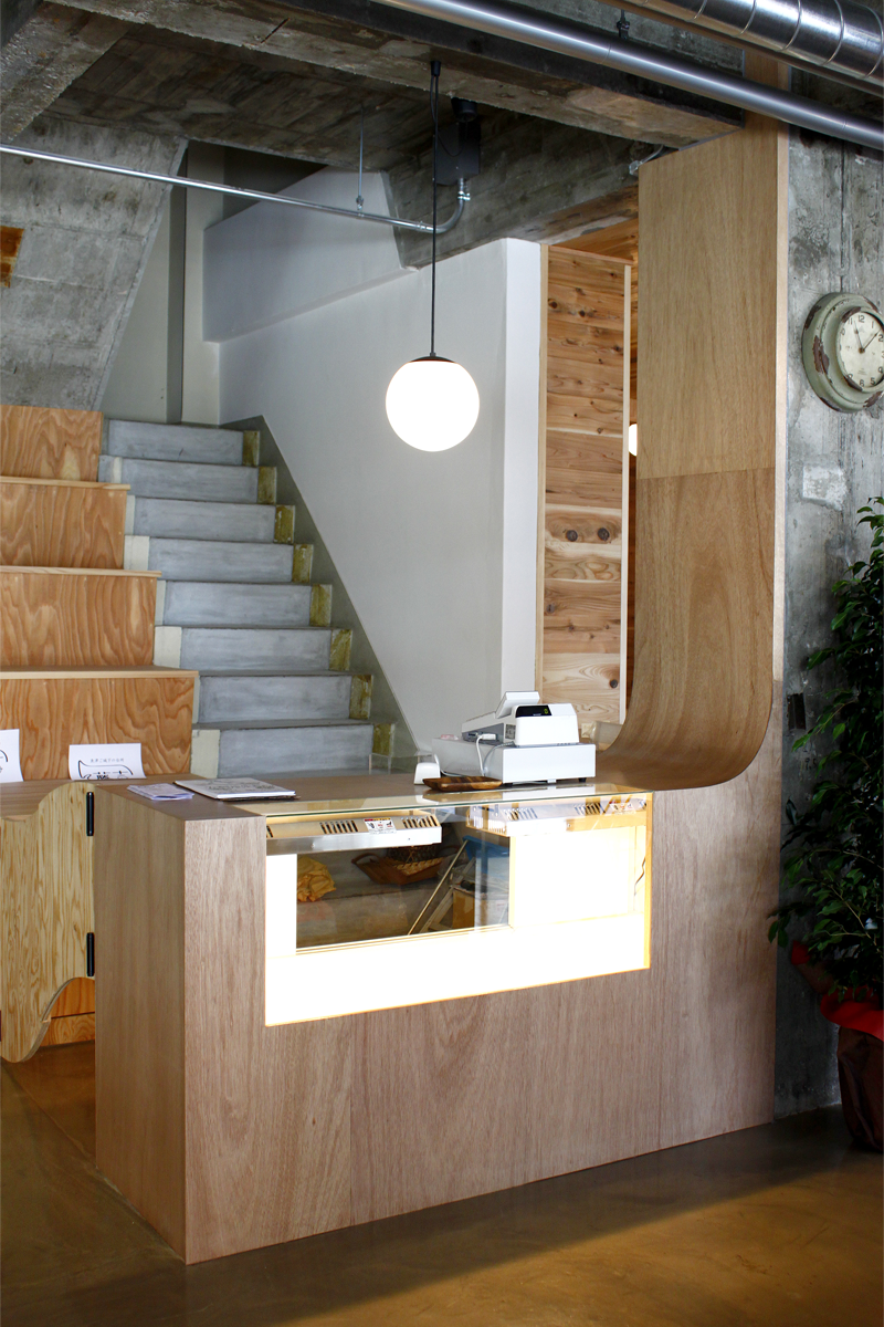
The building in which this renovation is housed was constructed after a large fire in Uozu, Japan on September 10, 1956 and so is heavily tied to the history of the town. Rather than hide its original concrete construction, much of it was left exposed in memory its history, showing the existing patterns and molds of cedar panels, concrete blocks, and plaster finishing on the walls and ceilings.
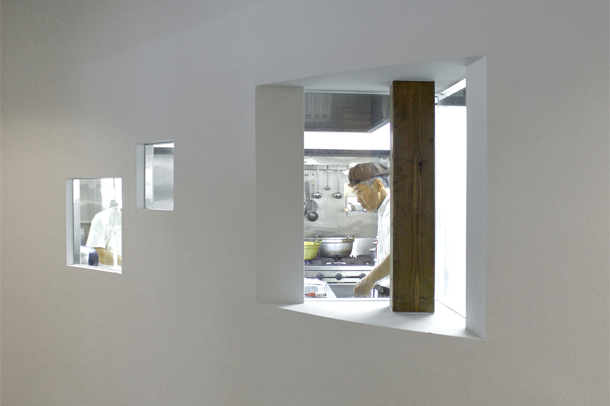
The interior consists of three different spaces: those marked by concrete, white, and wood. The concrete space exposes the history of the building through the exposed original walls. The white space has combined the starkness of a gallery with a sense cleanliness surrounding the kitchen. The last, wooden space is where new creative opportunities and people of various ages can gather in a three-sided box of cedar planks. The juxtaposition of these three spaces, historical, blank, and modern, create a new environment among the slow shopping street, providing a gathering place for visitors of all ages.

