KAMON
typeface | 2013


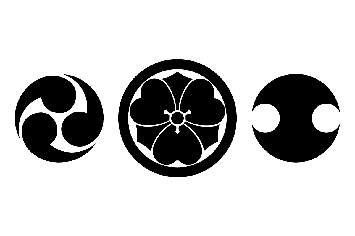


Two unique concepts become merged in Knezo Design Studio's logo and identity. One, the Japanese kamon, a highly graphical family crest, and the other, a western representation of the ratios present in the human body found in Cesariano’s Vetruvian Man. By combining these ideas from opposite sides of the world, a logo is formed which becomes the basis for a system from which other characters and symbols are developed. These both fit into the grid of the logo and are, in most cases, trimmed directly from the logo itself.